A real-time dashboard is a visualization surface that refreshes continuously as new data arrives, letting teams monitor live systems and act while the situation is still unfolding rather than after the fact. Its job is simple to state and hard to execute well: pull a data stream through a processing layer fast enough that a tile on screen still reflects reality. Done right, it collapses the gap between “something happened” and “someone responded.”
TL;DR:
- Streaming platforms like Kafka or Kinesis are essential for high-volume, sub-second data delivery in real-time dashboards.
- Visualization features such as KPI tiles, anomaly charts, and maps are chosen for their ability to instantly communicate status changes at a glance.
- Combining fast refresh protocols with thoughtful design and throttling prevents visual noise and maintains dashboard readability.
- WebSockets and Server-Sent Events are preferred for low-latency updates, whereas polling suits slower metrics and reduces complexity.
- Modular, prebuilt components enable faster deployment of custom dashboards, particularly for transaction-heavy and compliance-critical systems.
What Do Real-Time Dashboards Actually Monitor?
The concept only means something once you attach it to a job. A few patterns cover most of what teams build.
Operations monitoring. A factory floor or logistics hub tracks throughput, machine uptime, and queue depth on tiles that update every few seconds. The template usually pairs a KPI tile (units per hour), a time chart (throughput over the last 4 hours), and a status grid (which lines are down).
Order and fulfillment tracking. E-commerce and warehouse teams watch live order counts, pick queue depth, and SLA compliance side by side. A workable template is three tiles wide: orders received (last 15 minutes), average pick time, and percentage of orders inside their SLA window, color-coded when they slip.
Security and observability. Infrastructure teams watch error rate, request latency, and anomaly spikes, often layered over a time series with a threshold band. TechTarget’s definition of real-time monitoring lists server management and application performance monitoring among the most common use cases, alongside business telemetry.
Sales and promotion performance. Retail and marketing teams track sales velocity against a rolling baseline, watch promo codes redeem in real time, and compare regional performance on a map tile. The template here leans on a funnel chart plus a single “velocity vs. yesterday” KPI.
Each of these examples shares a structure: one or two headline KPIs, a time chart for trend, and a supporting visual (map, funnel, or grid) for context. That three-part shape is worth copying before you build anything more elaborate.
Which Visuals and Features Actually Matter?
Not every chart type earns a place on a live dashboard. The ones that hold up under constant refresh share a common trait: they communicate a state change at a glance, without requiring the viewer to study axes.
- KPI tiles for single numbers that need instant recognition (orders today, active users, current error rate).
- Time charts for trend and momentum, ideally with a rolling window rather than a full history.
- Anomaly charts that overlay a threshold band or statistical baseline so spikes are visually obvious, not something the viewer has to calculate.
- Heatmaps for density across categories, like traffic by hour and region.
- Funnels for conversion stages, especially in sales and fulfillment contexts.
- Maps for geographically distributed operations or fleet tracking.
Refresh behavior matters as much as chart choice. Some platforms support push-based live refresh that updates the instant new data lands; others rely on scheduled polling every few seconds. Microsoft Fabric’s Real-Time Dashboard supports live refresh alongside interactive filtering and drilldown, plus Copilot-assisted authoring that builds a dashboard from a natural-language description rather than a manually written query. That kind of assisted authoring is becoming a real productivity lever for teams without deep query language expertise on staff.
Interactivity and governance round out the feature list: filters that let a viewer slice by region or team, permission layers that control who can edit versus view, and version control for the dashboard definition itself. Fabric’s Git integration is one example of treating a dashboard like code rather than a one-off artifact that only one person understands.
How Should You Feed Data Into a Live Dashboard?
The ingestion pattern you pick determines your latency ceiling before you write a single query. Match the pattern to how fast the underlying event actually needs to be seen.
- Streaming platforms like Kafka, Kinesis, or Event Hubs fit high-volume, continuous event flows, such as clickstreams, sensor telemetry, or transaction logs, where sub-second delivery matters.
- Webhooks and push-based sources suit application events that fire occasionally but need to land instantly, like a payment confirmation or a support ticket escalation.
- Poll-based REST integrations are the simplest to build and the cheapest to maintain, but they trade latency for simplicity. Polling every 30 seconds is fine for a sales dashboard; it’s a poor fit for fraud detection.
- Short-term stores and materializations sit between the raw feed and the dashboard query. A minute-granular materialized layer lets a dashboard stay fast under complex aggregations without hammering the source datastore on every render.
Power BI’s documentation on real-time streaming semantic models draws a useful distinction between push models, where data is sent directly to the report, and streaming models, which buffer and forward events. That distinction shapes how much backend infrastructure you need to build versus what the platform handles for you.
Security and governance can’t be an afterthought on live feeds. Streaming pipelines need encryption in transit, scoped API keys per data source, and audit logging on who accessed which feed and when, especially for financial or health data flowing into a dashboard in near real time.
How Do You Keep a Constantly Updating Dashboard Readable?
A dashboard that refreshes every second but confuses the viewer has failed at its one job. Visual noise, not data volume, is usually what breaks a live dashboard.
Design for glanceability first. Decide which two or three numbers must always be visible without scrolling, and give everything else a secondary position. A viewer glancing at a wall-mounted screen from across a room should be able to read the state of the system in under three seconds.
- Rate-limit visual updates even if the underlying data changes faster. A stock ticker updating every 100 milliseconds looks alive; a bar chart redrawing that fast looks broken.
- Use aggregate or smoothed views (rolling averages, bucketed time windows) instead of raw point-by-point plotting, which produces jittery, unreadable lines.
- Reserve heavy animation for state changes that matter (a threshold breach), not for every data tick.
- Build separate layouts for a TV wall (large fonts, minimal interactivity, three or four tiles max) versus a desktop analyst view (denser grids, filters, drilldowns).
VitalWall’s approach to live visualization makes a useful distinction here: a “wall” built for ambient awareness should update within milliseconds, while a dashboard built for analysis can tolerate a slower, more considered refresh. Conflating the two is one of the more common design mistakes.
Pro Tip: Throttle client-side redraws with a simple debounce, updating the DOM at most once every 500 milliseconds even if the data stream delivers faster. Batch incoming events into a buffer and render the buffer on an interval instead of on every message. This one change often fixes sluggish dashboards more than any backend optimization does.
WebSockets, Polling, or Something Else?
The protocol choice is a latency versus complexity trade-off, and getting it wrong either wastes engineering effort or delivers a dashboard that feels sluggish.
- WebSockets and Server-Sent Events deliver the lowest latency for push updates and suit dashboards where seconds matter, like trading floors or incident response screens.
- Polling is acceptable when the underlying data changes slowly, a sales KPI updating every 30 to 60 seconds rarely needs a persistent connection. Minimize cost by polling only the delta, not the full dataset, on each request.
- Backend stream processing frameworks (Kafka Streams, Flink, or a managed equivalent) handle windowed aggregation and state before data ever reaches the dashboard layer, keeping the front end simple.
- Client-side strategies matter as much as the backend: batch multiple updates into a single render pass, send delta updates instead of full payloads, and virtualize long lists or grids so the browser only renders what’s visible.
Grafana’s guidance on setting up live, event-driven updates recommends event-driven protocols over aggressive polling and warns that pushing updates faster than roughly 100 milliseconds for complex charts tends to overwhelm client rendering rather than improve the experience. That threshold is a reasonable rule of thumb: below it, you’re usually paying for latency the human eye can’t use anyway. Complex SVG or DOM-based charts redrawing at very high frequency also create memory pressure and layout thrashing, which is why canvas-based rendering or delta updates hold up better under sustained load.
How Do You Turn a Dashboard Into an Alert System?
A dashboard that only displays numbers is doing half the job. The other half is converting a threshold breach into a notification someone actually acts on, without requiring a human to stare at the screen all day.
- Derive alert rules directly from the same queries powering your tiles. If a KPI tile tracks error rate, the alert threshold should reference that exact metric, not a separate calculation that can drift out of sync.
- Route alerts into the tools your team already lives in. Slack, PagerDuty, or a generic webhook endpoint are the common integration points, and most modern platforms support all three natively.
- Automate the response where possible. A webhook firing into a serverless function can restart a failed service, roll back a deployment, or open a ticket automatically, cutting the delay between detection and remediation.
- Tune alert sensitivity deliberately. A threshold set too tight produces alert fatigue; one set too loose misses real incidents. Define escalation runbooks so a first alert and a third unanswered alert don’t get the same response.
Fabric’s Data Activator is one example of a platform-native way to wire dashboard signals into automated actions rather than routing everything through custom glue code.
Pro Tip: Test new alert rules against historical data or a staging environment before flipping them on in production. A small pilot that checks update frequency, rendering load, and false-positive rate can save weeks of tuning after a noisy rollout.
How Bitecode Builds Enterprise-Grade Real-Time Dashboards
Bitecode approaches real-time dashboards as one module in a larger system, not a standalone widget bolted onto existing infrastructure. Because a significant portion of a baseline system arrives prebuilt, teams skip the months normally spent wiring ingestion, authentication, and tile rendering from scratch. That matters most for organizations layering dashboards on top of financial processing or blockchain-based transaction systems, where audit trails and multi-tenant embedding aren’t optional extras.
Security and auditing get treated as first-class requirements rather than a later pass. For teams evaluating how modular components speed up delivery in practice, Bitecode’s write-up on agentic workflows and Git-based collaboration and its breakdown of ready-made workflow components are useful starting points.
How Do You Scale a Dashboard Beyond a Handful of Users?
Performance problems on real-time dashboards rarely show up during a demo with three users. They show up at 200 concurrent viewers, or when the underlying event volume triples during a seasonal spike. Planning for that scale early avoids a painful rebuild later.
The most effective lever is separating the query layer from the raw data store. Instead of every dashboard render hitting your transactional database directly, a materialized or cached layer absorbs the read load, refreshing on its own schedule independent of viewer traffic. This is the same short-term materialization pattern used for sub-second freshness, applied here for a different reason: protecting the source system from being crushed by dashboard queries.
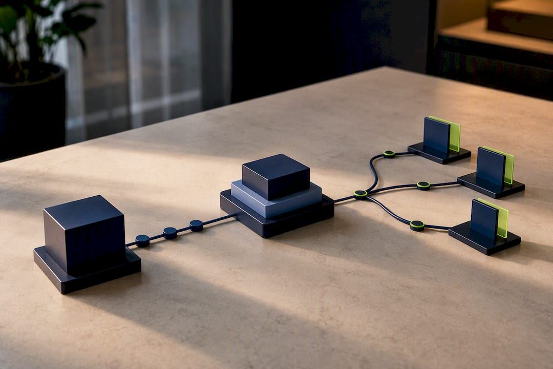
Horizontal scaling on the delivery side matters too. WebSocket connections consume server resources per open connection, so a dashboard serving thousands of simultaneous viewers needs a pub/sub layer (Redis, Kafka, or a managed equivalent) fanning updates out to connection handlers, rather than one monolithic server tracking every socket.
On the client, virtualization and pagination keep large data grids responsive regardless of how many rows exist upstream. Rendering only what’s visible in the viewport, and lazy-loading the rest, is a small change that prevents a dashboard from crawling as data volume grows. Caching computed aggregates (daily totals, rolling averages) rather than recalculating them on every request also cuts both latency and infrastructure cost as usage scales.
How Do the Major Platform Approaches Compare?
Real-time dashboard tools tend to split into three broad categories rather than a single spectrum, and picking the wrong category costs more than picking the wrong vendor within it.
Enterprise BI platforms with real-time extensions bring streaming and push-model support into an existing analytics suite. Power BI’s streaming semantic models and Fabric’s Real-Time Dashboard fall here, offering Copilot-assisted authoring and Git-based version control alongside conventional BI reporting. These suit teams that already run analytics on the platform and want live tiles without adopting a second tool.
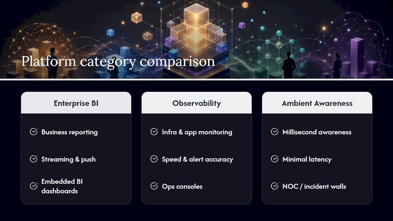
Observability and ops-focused platforms prioritize event-driven protocols and rendering performance over broad analytical depth. Grafana’s live-update architecture is built for infrastructure and application monitoring, where the priority is speed and alert accuracy over polished business reporting.
Ambient awareness tools occupy a distinct category from either. Products like VitalWall and log-streaming tools like Tailstream are built for millisecond-level awareness surfaces (NOC walls, incident rooms), explicitly separate from dashboards meant for deeper analysis. Choosing this category for a boardroom sales report, or a BI platform for an incident wall, is a common mismatch worth avoiding.
For organizations that need dashboards woven into custom financial or compliance workflows rather than sitting on top of an off-the-shelf BI suite, a modular custom build often fits better than any of these three categories alone.
Where Is Real-Time Dashboard Technology Headed?
Natural-language authoring is the most visible shift underway. Copilot-style assistants that generate a dashboard from a plain description of what you want to track are already shipping in mainstream BI tools, and that trend will likely expand rather than remain a niche feature. The practical effect: teams without deep query language expertise can prototype a dashboard in minutes instead of waiting on a data engineer.
Event-driven automation is also moving further into the dashboard layer itself, rather than living in a separate alerting tool. Platforms increasingly let a threshold breach trigger a workflow directly from the dashboard’s own query engine, blurring the line between “monitoring tool” and “automation platform.”
Expect continued divergence between analytical dashboards and ambient awareness surfaces as distinct product categories, each optimized for a different cognitive task, rather than one tool trying to do both jobs adequately. Version-controlled, Git-backed dashboard definitions, already present in tools like Fabric, are also likely to become standard practice rather than an advanced feature, as teams start treating dashboards as deployable artifacts subject to the same review process as application code.
When Should You Build Custom Instead of Buying a Platform?
A managed platform wins on speed for standard reporting needs. Custom development earns its cost when the dashboard has to enforce audit trails, multi-currency logic, or blockchain-based transaction verification that off-the-shelf tools don’t model natively. Complex automation tied to compliance is the clearest signal you’ve outgrown a template. A pilot on a modular foundation, tested against real data volume before full rollout, is the lowest-risk way to find out which category you’re actually in.
— Bitecode
Get a Production Real-Time Dashboard Built Faster
Bitecode is the alternative to a from-scratch engineering build for teams that need a real-time dashboard wired into financial processing, blockchain data, or workflow automation, not just a generic chart on a webpage. Because up to 60% of the baseline system arrives prebuilt from modular components, a first working dashboard typically reaches your team far faster than a greenfield build, without locking you into a rigid off-the-shelf template.
A typical engagement starts with a scoped pilot: connecting your actual data source, wiring one or two priority KPI tiles, and validating refresh performance before expanding to the full system. From there, Bitecode’s automation services extend the dashboard into alerting and event-driven workflows, and the custom web app development service handles the rest of the build, from data ingestion through the finished interface. For a look at how modular components speed up delivery on transaction-heavy systems, read the transaction monitoring case study. If your team is ready to scope a pilot, start with a conversation about your data sources and the KPIs that matter most.
Sources
- Real-Time Dashboards overview — Microsoft Fabric
- Set up Grafana Live — Grafana docs
- What is real-time monitoring? — TechTarget
- VitalWall — live data visualization platform
FAQ
What Is a Real-Time Dashboard?
A real-time dashboard is a visualization surface that updates continuously as new data arrives, typically through live refresh, streaming, or push-based connections, so viewers see current system state rather than a delayed snapshot.
What Is an Example of Real-Time Monitoring?
Common examples include server and data center management, application performance monitoring, and business telemetry like live order counts or inventory levels, all of which surface as tiles on a live dashboard.
What Is Real-Time Visualization?
Real-time visualization is the practice of rendering data on charts or tiles as it changes, using techniques like delta updates and rate limiting to keep the display readable without overwhelming the viewer or the browser.
Should I Use Polling or WebSockets for My Dashboard?
Use WebSockets or Server-Sent Events when updates need to appear within seconds, and reserve polling for slower-moving metrics where a 30 to 60 second delay is acceptable and the added infrastructure isn’t worth it.
Can Bitecode Build a Custom Real-Time Dashboard for My Business?
Yes. Bitecode builds real-time dashboards as part of custom enterprise systems, using modular prebuilt components to connect live data sources to audit-ready, scalable interfaces faster than a from-scratch build.